What are Responsive Websites
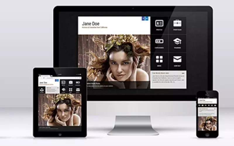
The easiest way to explain responsive websites is with a picture and I have done just that. Take a closer look at the picture in this blog, it demonstrates "Slider Metro" website on a monitor, iPad and iPhone. As you see all of which look differently without losing any quality or ease of use.
What are responsive actor websites?
Responsive Actor Websites are websites that are build in a way that they can be displayed properly on any width of the screen. If you resize the screen the website will "respond" and will change slightly to accommodate the resizing. Every actor websites should be responsive.
Why should every actor website be responsive?
This is the 21st century - many times we are on-the-go, and we don't always carry laptops anymore. We carry tablets and smart phones. Have you seen your website on a smart-phone? Can you read anything or do you have to zoom in a lot. And once you zoom in a lot, can you see other parts of the website easily? Can you navigate through your website easily? If you said "no" to any of the above questions, then your website is not responsive and many of the users will never even want to take a look at it from their mobile devices. All of our templates have been optimized to work with responsiveness.
How are IADB actor websites responsive?
It's best to just take a look. Every website responds in a different way. For instance "Metro Slider" website demonstrated on the screenshot on this page was designed on the iPad itself. If you view it in iPad horizontal mode, scrolling down to the bottom will give you a full-screen slideshow, while having it in portrait mode will display the website in its entirety without needing to scroll the page.


